I came across this tweet the other day:
@BroereAlex @Azure Wow, that’s a pretty interesting question.. should be possible with PowerBI integration.Challenge accepted!
— assaf neufeld (@assaf___) March 15, 2017
It sounded a lot like a challenge to me, so I just couldn’t resist!!
Sankey diagrams for those who don’t know are an amazing tool for describing user flows AND are the basis for one of the most famous data visualizations of all-time. But really, I had no idea how to create one. So, I googled Sankey + PowerBI and came across this fantastic Amir Netz video:
So all you need to create the diagram is a table with 3 columns:
- Source
- Destination
- Count
And PowerBI takes care of the rest.
We already know you can take any App Insights Analytics query and “export” the data to PowerBI.
So the only problem now is how do I transform my AppInsights custom events table into a Sankey events table?
Let’s go to Analytics!
First it’s best to have an idea of what we’re trying to do. Decide on 5-10 events that make sense for a user session flow. In my case, I want to see the flow of users through a new feature called “CTD”. So the events I chose are:
- CTD_Available (feature is available for use)
- CTD_Result (user used the feature and got a result)
- CTD_DrillIn (user chose to further drill-in the results)
- CTD_Feedback (user chose to give feedback)
In every step, I’m interested in seeing how many users I’m “losing”, and what they’re doing next.
Ok, let’s get to work!
First query we’ll
- Filter out only relevant events
- Sort by timestamp asc (don’t forget that in this chart, order is important!)
- Summarize by session_id using makelist, to put all events that happened in that session in an ordered list. If you’re unfamiliar with makelist, all it does is take all the values of the column, and stuffs them into a list. The resulting lists are the ordered events that users triggered in each session.
customEvents
| where timestamp > ago(7d)
| where name=="CTD_Available" or name=="CTD_Result" or
        name=="CTD_Drillin" or name== "CTD_Feedback"
| sort by timestamp asc
| summarize l=makelist(name) by session_Id
Next step I’ll do is add an “EndSession” event to each list, just to make sure my final diagram is symmetric. You might already have this event as part of your telemetry, I don’t. This is optional, and you can choose to remove this line.
| extend l=todynamic(replace(@"\]", ',"EndSession" ]', tostring(l))) Next step, I’d like to create “tuples” for source and destination from each list. I want to turn:
Available -> Result -> Feedback -> EndSession
Into:
[Available, Result], [Result, Feedback], [Feedback, EndSession]
To do this, I need to chop off the first item in the list and “zip” it (like a zipper) with the original list. In c# this is very easy – list.Zip(list.Skip(1))..
Amazingly, App Analytics has a zip command! Tragically, it doesn’t have a skip… :(. Which means we need to do some more ugly regex work in order to chop off the first element.
| extend l_chopped=todynamic(replace(@"\[""(\w+)"",", @"[", tostring(l)))Then I zip, and use mvexpand, to create one row per tuple created
| extend z=zip(l, l_chopped)
| mvexpand z
And I remove the lonely “EndSession”s which are useless artifacts.
| where tostring(z[0]) != "EndSession"Last thing left to do is summarize to get the counts for each unique tuple, and remove the tuples with identical source and destinations.
The final query:
customEvents
| where timestamp > ago(7d)
| where name=="CTD_Available" or name=="CTD_Result" or
        name=="CTD_Drillin" or name== "CTD_Feedback"
| sort by timestamp asc
| summarize l=makelist(name) by session_Id
| extend l=todynamic(replace(@"\]", ',"EndSession" ]', tostring(l)))
| extend l_chopped=todynamic(replace(@"\[""(\w+)"",", @"[", tostring(l)))
| extend z=zip(l, l_chopped)
| mvexpand z
| where tostring(z[0]) != "EndSession"
| summarize cnt() by source=tostring(z[0]),dest=tostring(z[1])
| where source!=dest
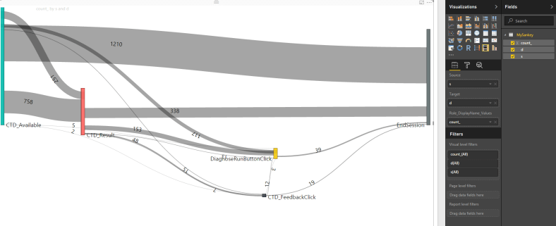
We’re in business!
Now I want to get this data to Power BI…
- Download Power BI desktop.
- Goto the Power BI visuals gallery, search “sankey” and download the visuals you want (my preference is “sankey with labels”)
- Open Power BI, and goto GetData -> BlankQuery
- In Query editor, goto View -> Advanced Editor
- Now go back to the prepared AppAnalytics query, and hit export to Power BI

- Take the query in the downloaded text file, and paste it into the query editor
- Press done
Now the data should be there! Just one more step!
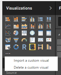
- Back in PowerBI, import the visuals you previously downloaded

- Select Source -> source, Destination -> dest, Weight -> count_
WOOT!

This is awesome! thanks.
LikeLike
Had to modify the regex has our “name” contains “-“.
LikeLike