Okay, another question from Twitter (original content will have to wait till I get some more free time!)
Here’s the challenge:
Need help with #Azure#AppInsights: when summarizing, I want to adjust the bin size according to the time range the user selects in the Query editor. I found `bin_auto(timestamp)` which looks promising, but still I need to `set query_bin_auto_size=1m` manually. Any clues? pic.twitter.com/TtwCTH5OtR
So what we need to do here is somehow infer the time-range of the query, and then create a fixed set of time bins according to that range.
I think the only way to that is by performing 2 queries – one to get the time range and convert it into a fixed interval, and a second query with the actual logic.
To convert the result of the first query into a ‘variable’ we can use in the second query, I’ll use the ‘toscalar‘ operation.
Here we go:
let numberOfBuckets = 24;
let interval = toscalar(requests
| summarize interval = (max(timestamp)-min(timestamp)) / numberOfBuckets
| project floor(interval, 1m));
requests
| summarize count() by bin(timestamp , interval)
I use ‘floor’ here just to round the interval and make the results a bit more readable.
A common ask I’ve heard from several users, is the ability to fill gaps in your data in Kusto/App Analytics/DataExplorer (lots of names these days!):
@assaf___ any best practice how to “fill time gaps” in a kusto query after a summarize on timestamp? (a timechart will draw the line between the known points and I want a missing point to be drawn as 0)
If your data has gaps in time in it, the default behavior for App Analytics is to “connect the dots”, and not really reflect that there was no data in these times. In lots of cases we’d like to fill these missing dates with zeros.
The way to go to handle this, is to use the “make-series” operator. This operator exists to enable advanced time-series analysis on your data, but we’ll just use it for the simple use-case of adding missing dates with a “0” value.
Some added sophistication is converting the series back to a *regular* summarize using “mvexpand”, so we can continue to transform the data as usual.
Here’s the query (Thanks Tom for helping refine this query!) :
let start=floor(ago(3d), 1d);
let end=floor(now(), 1d);
let interval=5m;
requests
| where timestamp > start
| make-series counter=count() default=0
              on timestamp in range(start, end, interval)
| mvexpand timestamp, counter
| project todatetime(timestamp), toint(counter)
| render timechart
One of the major use cases for log analytics is root cause investigation. For this, many times you just want to look at all your data, and find records that relate to a specific session, operation, or error. I already showed one way you can do this using ‘search’, but I want to show how you can do this using ‘union *‘ which is a more versatile.
union *
| where timestamp > ago(1d)
| where operation_Id contains '7'
| project timestamp, operation_Id, name, message
union *
| where timestamp > ago(1d)
| where * contains 'error'
| project timestamp, operation_Id, name, message
This is really powerful, and can be used to basically do a full table scan across all your data.
But one thing that always annoyed me is that you never know which table the data came from. I just discovered a really easy way to get this – using the ‘withsource’ qualifier:
union withsource=sourceTable *
| where timestamp > ago(1d)
| where * contains 'error'
| project sourceTable, timestamp, operation_Id, name, message
I’ll keep it short and simple this time. Here’s a great way to debug your app across multiple App Insights instances.
So, I have two Azure Functions services running, with one serving as an API, and the other serving as BE processing engine. Both report telemetry to App Insights (different apps), and I am passing a context along from one to the other – so I can correlate exceptions and bugs.
Wouldn’t it be great to be able to see what happened in a single session across the 2 apps?
It’s possible – using ‘app‘ – just plugin the name of the app insights resource you want to query, and a simple ‘union‘.
Here you go:
let session="reReYiRu";
union app('FE-prod').traces, app('BE-prod').traces
| where session_Id == session
| project timestamp, session_Id, appName, message
| order by timestamp asc
Don’t forget –
You can use the field ‘appName‘ to see which app this particular trace is coming from.
Different machines have different times.. Don’t count on the timestamp ordering to always be correct.
There is a nifty little operator in Azure Log Analytics that has really simplified how I work with regular expressions – It’s called “parse” and I’ll explain it through a little example.
Let’s say you have a service that emits traces like:
traces
| where message contains "Error"
| project message
11:07 Error-failed to connect to DB(code: 100)
12:02 Error-failed to connect to DB(code: 100)
12:05 Error-query failed on syntax(code: 355)
12:06 Error-query failed on timeout(code: 567)
I’d like to count how many errors I have from each code, and then put the whole thing on a timechart that I can add to my dashboard, in order to monitor errors in my service.
Obviously I’d like to extract the error code from the trace, so I need a regular expression.
Well, if you’re anything like me the first thing you’ll do is start feverishly googling regular expressions to try to remember how the heck to do it… and then flailing for like an hour until getting it right.
Well, using parse, things are much much easier:
traces
| where message contains "Error"
| parse message with * "(code: " errorCode ")" *
| project errorCode
100
100
355
567
And from here summarizing is just a breeze:
traces
| where message contains "Error"
| parse message with * "(code: " errorCode ")" *
| summarize count() by errorCode, bin(timestamp, 1h)
| render areachart kind=stacked
Engagement/Usage metrics are some of the most commonly used, yet tricky to calculate metrics out there. I myself have seen just about 17 different ways to calculate stickiness, churn, etc. in analytics – each with its own drawbacks, all of them complex and hard to understand.
It was complex and convoluted (yes, I’ll admit it!)
Hyper-log-log (hll) has known limitations in precision, especially when dealing with small numbers.
I’m really glad to showcase some new capabilities in Azure Log Analytics that super-simplify everything about these metrics. These are the new operators:
evaluate activity_engagement(...)
evaluate activity_metrics(...)
I really won’t babble too much here, there’s official documentation for that. But the basic concept is so easy you should really just try it out for yourself.
First, stickiness (rolling dau/mau). So, so simple:
union *
| where timestamp > ago(90d)
| evaluate activity_engagement(user_Id, timestamp, 1d, 28d)
| project timestamp, Dau_Mau=activity_ratio*100
| where timestamp > ago(62d) // remove tail with partial data
| render timechart
union *
| where timestamp > ago(90d)
| evaluate activity_metrics(user_Id , timestamp, 7d)
| project timestamp , retention_rate, churn_rate
| where retention_rate > 0 and
  timestamp < ago(7d) and timestamp > ago(83d) // remove partial data in tail and head
| render timechart
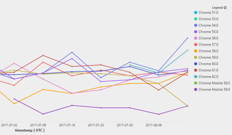
Even cooler – you can add dimensions to slice your usage data accordingly. Here is a chart of my apps’ retention rates for different versions of the chrome browser:
union *
| where timestamp > ago(90d)
| where client_Browser startswith "chrome"
| evaluate activity_metrics(user_Id , timestamp, 7d, client_Browser   )
| where dcount_values > 3
| project timestamp , retention_rate, client_Browser
| where retention_rate > 0 and
  timestamp < ago(7d) and timestamp > ago(83d) // remove partial data in tail and head
| render timechart
App Insights Analytics just released Smart Diagnostics, and it is by far the best application of Machine Learning analytics in the service to date.
I’ve posted before about some ML features such as autocluster and smart alerting, but this one really takes the cake as the most powerful and useful yet:
It’s super-duper easy to use! Despite the huge complexity of the Machine Learning algo behind the scenes.
It’s fast!
It can give you awesome answers that save you lots of investigation time and agony.
It works by analyzing spikes in charts, and giving you a pattern that explains the sudden change in the data.
So let’s give it a go!
Analyze spike in dependency duration
I run a service that has all kinds of remote dependencies – calls to Azure blobs, queues, http requests, etc.
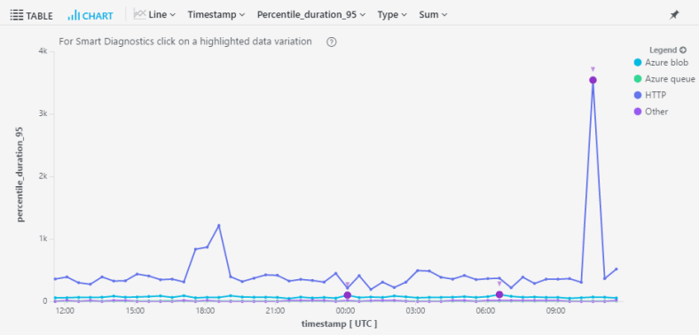
In my devops hat, I run this simple query almost daily just to gauge the health of my service – a look at the 95th percentile for call duration by dependency type:
dependencies
| where timestamp > ago(1d)
| where operation_SyntheticSource == ""
| summarize percentile(duration, 95) by bin(timestamp,30m), type
| render timechart
The results look like this:
Right off the bat I can see something very funky going on in my http calls. I wanna know exactly what’s going on, but drilling in to the raw data can be a messy business.
If only there was a way to analyze that spike with just one click…. !!!
Fortunately, there’s a small purple dot on that spike. It signifies that this spike is available for analysis with Machine Learning (aka Smart Diagnostics).
Once I click on it, the magic happens.
Smart Diagnostics just told me that the cause for the spike in call duration was:
It sounded a lot like a challenge to me, so I just couldn’t resist!!
Sankey diagrams for those who don’t know are an amazing tool for describing user flows AND are the basis for one of the most famous data visualizations of all-time. But really, I had no idea how to create one. So, I googled Sankey + PowerBI and came across this fantastic Amir Netz video:
So all you need to create the diagram is a table with 3 columns:
Source
Destination
Count
And PowerBI takes care of the rest.
We already know you can take any App Insights Analytics query and “export” the data to PowerBI.
So the only problem now is how do I transform my AppInsights custom events table into a Sankey events table?
Let’s go to Analytics!
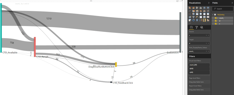
First it’s best to have an idea of what we’re trying to do. Decide on 5-10 events that make sense for a user session flow. In my case, I want to see the flow of users through a new feature called “CTD”. So the events I chose are:
CTD_Available (feature is available for use)
CTD_Result (user used the feature and got a result)
CTD_DrillIn (user chose to further drill-in the results)
CTD_Feedback (user chose to give feedback)
In every step, I’m interested in seeing how many users I’m “losing”, and what they’re doing next.
Ok, let’s get to work!
First query we’ll
Filter out only relevant events
Sort by timestamp asc (don’t forget that in this chart, order is important!)
Summarize by session_id using makelist, to put all events that happened in that session in an ordered list. If you’re unfamiliar with makelist, all it does is take all the values of the column, and stuffs them into a list. The resulting lists are the ordered events that users triggered in each session.
customEvents
| where timestamp > ago(7d)
| where name=="CTD_Available" or name=="CTD_Result" or
        name=="CTD_Drillin" or name== "CTD_Feedback"
| sort by timestamp asc
| summarize l=makelist(name) by session_Id
Next step I’ll do is add an “EndSession” event to each list, just to make sure my final diagram is symmetric. You might already have this event as part of your telemetry, I don’t. This is optional, and you can choose to remove this line.
To do this, I need to chop off the first item in the list and “zip” it (like a zipper) with the original list. In c# this is very easy – list.Zip(list.Skip(1))..
Amazingly, App Analytics has a zip command! Tragically, it doesn’t have a skip… :(. Which means we need to do some more ugly regex work in order to chop off the first element.
There’s a pretty nice operator in Kusto (or App Insights Analytics) called top-nested.
It basically allows you to do a hierarchical drill-down by dimensions. Sounds a bit much, but it’s much clearer when looking at an example!
So a simple use for it could be something like getting the top 5 result-codes, and then a drill down for each result code of top 3 request names for each RC.
requests
| where timestamp > ago(1h)
| top-nested 5 of resultCode by count(),
  top-nested 3 of name by count()
So I can easily see which operation names are generating the most 404’s for instance.
This is pretty cute, and can be handy for faceting.
But I actually find it more helpful in a couple of other scenarios.
First one is getting a chart of only the top N values. For instance, if I chart my app usage by country, I get a gazillion series of all different countries. How can I easily filter the chart to show just my top 10 countries? Well one way is to do the queries separately, and add a bunch of where filters to the chart…
But top nested can save me all that work:
let top_countries = view()
{
  customEvents
  | where timestamp > ago(3d)
  | top-nested 5 of client_CountryOrRegion by count()
};
top_countries
| join kind= inner
  (customEvents
    | where timestamp >= ago(3d)
   ) on client_CountryOrRegion
| summarize count() by bin(timestamp, 1h), client_CountryOrRegion
| render timechart
A beautiful view of just my top 5 countries…
I’ve actually used the same technique for a host of different dimensions (top countries, top pages, top errors etc.), and it can also be useful to filter OUT top values (such as top users skewing the numbers), by changing the join to anti-join.
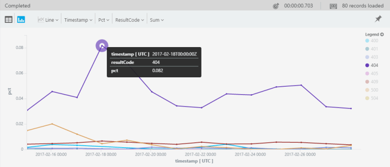
The second neat scenario is calculating percentages of a whole. For instance – how do you calculate the percentage of traffic per RC daily?
Yeah, you can do this using a summarize and the (newly-added) areachart stacked100 chart kind:
requests
| where timestamp >= ago(3d)
| where isnotempty(resultCode)
| summarize count() by bin(timestamp, 1h), resultCode
| render areachart kind=stacked100
But this only partially solves my problem.
Because ideally, I don’t want to look at all these 200’s crowding my chart. I would like to look at only the 40X’s and 500’s, but still as a percentage of ALL my traffic.
I could do this by adding a bunch of countif(rc=403)/count(), countif(rc=404)/count()… ad nauseum, but this is tiresome + you don’t always know all possible values when creating a query.
Here’s where top-nested comes in. Because it shows the aggregated value for each level, creating the percentages becomes super-easy. The trick is simply doing the first top-nested by timestamp:
requests
| where timestamp > ago(14d)
| top-nested 14 of bin(timestamp, 1d) by count() ,
  top-nested 20 of resultCode by count()
| where resultCode !startswith("20")
| where resultCode !startswith("30")
| project pct=aggregated_resultCode * 1.0 / aggregated_timestamp,
          timestamp, resultCode
| render timechart


