Searching all Tables with Union, Searching all Fields with ‘*’

One of the major use cases for log analytics is root cause investigation. For this, many times you just want to look at all your data, and find records that relate to a specific session, operation, or error. I already showed one way you can do this using ‘search’, but I want to show how you can do this using ‘union *‘ which is a more versatile.

union *
| where timestamp > ago(1d)
| where operation_Id contains '7'
| project timestamp, operation_Id, name, message

In fact I already used ‘union *’ when I wanted to count users across all tables.
Another useful tool is searching across all fields – you can do this with ‘where *‘:

union *
| where timestamp > ago(1d)
| where * contains 'error'
| project timestamp, operation_Id, name, message

This is really powerful, and can be used to basically do a full table scan across all your data.
But one thing that always annoyed me is that you never know which table the data came from. I just discovered a really easy way to get this – using the ‘withsource’ qualifier:

union withsource=sourceTable *
| where timestamp > ago(1d)
| where * contains 'error'
| project sourceTable, timestamp, operation_Id, name, message

Cross App Queries in Azure Log Analytics

I’ll keep it short and simple this time. Here’s a great way to debug your app across multiple App Insights instances.

So, I have two Azure Functions services running, with one serving as an API, and the other serving as BE processing engine. Both report telemetry to App Insights (different apps), and I am passing a context along from one to the other – so I can correlate exceptions and bugs.

Wouldn’t it be great to be able to see what happened in a single session across the 2 apps?

It’s possible – using ‘app‘ – just plugin the name of the app insights resource you want to query, and a simple ‘union‘.

Here you go:

let session="reReYiRu";
union app('FE-prod').traces, app('BE-prod').traces
| where session_Id == session 
| project timestamp, session_Id, appName, message
| order by timestamp asc 


Don’t forget –

  1. You can use the field ‘appName‘ to see which app this particular trace is coming from.
  2. Different machines have different times.. Don’t count on the timestamp ordering to always be correct.

Using Azure Log Analytics to Calculate User Engagement Metrics

Engagement/Usage metrics are some of the most commonly used, yet tricky to calculate metrics out there. I myself have seen just about 17 different ways to calculate stickiness, churn, etc. in analytics – each with its own drawbacks, all of them complex and hard to understand.

I’ve touched on this subject before when I offered a query for stickiness, but

  1. It was complex and convoluted (yes, I’ll admit it!)
  2. Hyper-log-log (hll) has known limitations in precision, especially when dealing with small numbers.

I’m really glad to showcase some new capabilities in Azure Log Analytics that super-simplify everything about these metrics. These are the new operators:

evaluate activity_engagement(...)
evaluate activity_metrics(...)

I really won’t babble too much here, there’s official documentation for that. But the basic concept is so easy you should really just try it out for yourself.

First, stickiness (rolling dau/mau). So, so simple:

union *
| where timestamp > ago(90d)
| evaluate activity_engagement(user_Id, timestamp, 1d, 28d)
| project timestamp, Dau_Mau=activity_ratio*100 
| where timestamp > ago(62d) // remove tail with partial data
| render timechart 

Churn + Retention rate (week over week):

union *
| where timestamp > ago(90d)
| evaluate activity_metrics(user_Id , timestamp, 7d)
| project timestamp , retention_rate, churn_rate
| where retention_rate > 0 and 
  timestamp < ago(7d) and timestamp > ago(83d) // remove partial data in tail and head
| render timechart

Even cooler – you can add dimensions to slice your usage data accordingly. Here is a chart of my apps’ retention rates for different versions of the chrome browser:

union *
| where timestamp > ago(90d)
| where client_Browser startswith "chrome" 
| evaluate activity_metrics(user_Id , timestamp, 7d, client_Browser   )
| where dcount_values > 3
| project timestamp , retention_rate, client_Browser 
| where retention_rate > 0 and 
  timestamp < ago(7d) and timestamp > ago(83d) // remove partial data in tail and head
| render timechart

RetentionRate

Search in App Analytics

The questions I get most often about Analytics aren’t usually about super-complicated queries or magic ML functions.

It’s usually just about how to find specific logs in an investigation.

App Insights Analytics has a really simple way to do it – search. This will search for a keyword across all your tables, across all columns.

search "Error"

If you look at the results, the first column is called $table – it is the name of the table from which the results came from.

You can combine search with a summarize, or any other filter you need:

search "Error" 
| summarize count() by bin(timestamp, 1h)
| render timechart  

It’s also possible to search in specific tables:

search "fail" in (customEvents, dependencies)

Happy searching!

Diagnose Metric Anomalies with Single-Click Machine-Learning Analytics Magic

App Insights Analytics just released Smart Diagnostics, and it is by far the best application of Machine Learning analytics in the service to date.

I’ve posted before about some ML features such as autocluster and smart alerting, but this one really takes the cake as the most powerful and useful yet:

  • It’s super-duper easy to use! Despite the huge complexity of the Machine Learning algo behind the scenes.
  • It’s fast!
  • It can give you awesome answers that save you lots of investigation time and agony.

It works by analyzing spikes in charts, and giving you a pattern that explains the sudden change in the data.

So let’s give it a go!

Analyze spike in dependency duration

I run a service that has all kinds of remote dependencies – calls to Azure blobs, queues, http requests, etc.

In my devops hat, I run this simple query almost daily just to gauge the health of my service – a look at the 95th percentile for call duration by dependency type:

dependencies
| where timestamp > ago(1d)
| where operation_SyntheticSource == ""
| summarize percentile(duration, 95) by bin(timestamp,30m), type
| render timechart

The results look like this:

dep_percentile_95

Right off the bat I can see something very funky going on in my http calls. I wanna know exactly what’s going on, but drilling in to the raw data can be a messy business.

If only there was a way to analyze that spike with just one click…. !!!

Fortunately, there’s a small purple dot on that spike. It signifies that this spike is available for analysis with Machine Learning (aka Smart Diagnostics).

Once I click on it, the magic happens.

dep_percentile_95_result

Smart Diagnostics just told me that the cause for the spike in call duration was:

  • name: https://../observation
  • operation_Name: HealthyFlow
  • resultCode: 409
  • success: False

Whoa!

Furthermore, looking at the chart I see that calls without this pattern are totally flat in this time period.

This is definitive proof that the spike was caused by failed calls to this dependency. My work here is done in seconds.

matrix_whoa

Creating Beautiful Sankey Diagrams From App Insights Custom Events

I came across this tweet the other day:

It sounded a lot like a challenge to me, so I just couldn’t resist!!

Sankey diagrams for those who don’t know are an amazing tool for describing user flows AND are the basis for one of the most famous data visualizations of all-time. But really, I had no idea how to create one. So, I googled Sankey + PowerBI and came across this fantastic Amir Netz video:

So all you need to create the diagram is a table with 3 columns:

  • Source
  • Destination
  • Count

And PowerBI takes care of the rest.

We already know you can take any App Insights Analytics query and “export” the data to PowerBI.

So the only problem now is how do I transform my AppInsights custom events table into a Sankey events table?

Let’s go to Analytics!

First it’s best to have an idea of what we’re trying to do. Decide on 5-10 events that make sense for a user session flow. In my case, I want to see the flow of users through a new feature called “CTD”. So the events I chose are:

  • CTD_Available (feature is available for use)
  • CTD_Result (user used the feature and got a result)
  • CTD_DrillIn (user chose to further drill-in the results)
  • CTD_Feedback (user chose to give feedback)

In every step, I’m interested in seeing how many users I’m “losing”, and what they’re doing next.

Ok, let’s get to work!

First query we’ll

  • Filter out only relevant events
  • Sort by timestamp asc (don’t forget that in this chart, order is important!)
  • Summarize by session_id using makelist, to put all events that happened in that session in an ordered list. If you’re unfamiliar with makelist, all it does is take all the values of the column, and stuffs them into a list. The resulting lists are the ordered events that users triggered in each session.
customEvents
| where timestamp > ago(7d)
| where name=="CTD_Available" or name=="CTD_Result" or 
        name=="CTD_Drillin" or name== "CTD_Feedback"
| sort by timestamp asc
| summarize l=makelist(name) by session_Id

Next step I’ll do is add an “EndSession” event to each list, just to make sure my final diagram is symmetric. You might already have this event as part of your telemetry, I don’t. This is optional, and you can choose to remove this line.

| extend l=todynamic(replace(@"\]", ',"EndSession" ]', tostring(l))) 

Next step, I’d like to create “tuples” for source and destination from each list. I want to turn:

Available -> Result -> Feedback -> EndSession

Into:

[Available, Result], [Result, Feedback], [Feedback, EndSession]

To do this, I need to chop off the first item in the list and “zip” it (like a zipper) with the original list. In c# this is very easy – list.Zip(list.Skip(1))..

Amazingly, App Analytics has a zip command! Tragically, it doesn’t have a skip… :(. Which means we need to do some more ugly regex work in order to chop off the first element.

| extend l_chopped=todynamic(replace(@"\[""(\w+)"",", @"[", tostring(l)))

Then I zip, and use mvexpand, to create one row per tuple created

| extend z=zip(l, l_chopped) 
| mvexpand z

And I remove the lonely “EndSession”s which are useless artifacts.

| where tostring(z[0]) != "EndSession"

Last thing left to do is summarize to get the counts for each unique tuple, and remove the tuples with identical source and destinations.

The final query:

customEvents
| where timestamp > ago(7d)
| where name=="CTD_Available" or name=="CTD_Result" or 
        name=="CTD_Drillin" or name== "CTD_Feedback"
| sort by timestamp asc
| summarize l=makelist(name) by session_Id
| extend l=todynamic(replace(@"\]", ',"EndSession" ]', tostring(l))) 
| extend l_chopped=todynamic(replace(@"\[""(\w+)"",", @"[", tostring(l)))
| extend z=zip(l, l_chopped) 
| mvexpand z
| where tostring(z[0]) != "EndSession"
| summarize cnt() by source=tostring(z[0]),dest=tostring(z[1])
| where source!=dest

We’re in business!

Now I want to get this data to Power BI…

  • Download Power BI desktop.
  • Goto the Power BI visuals gallery, search “sankey” and download the visuals you want (my preference is “sankey with labels”)
  • Open Power BI, and goto GetData -> BlankQuery
  • In Query editor, goto View -> Advanced Editor
  • Now go back to the prepared AppAnalytics query, and hit export to Power BI

ExportPBI

  • Take the query in the downloaded text file, and paste it into the query editor
  • Press done

Now the data should be there! Just one more step!

  • Back in PowerBI, import the visuals you previously downloaded

ImportVisuals

  • Select Source -> source, Destination -> dest, Weight -> count_

WOOT!

Sankey

Cool uses for the top-nested operator

There’s a pretty nice operator in Kusto (or App Insights Analytics) called top-nested.

It basically allows you to do a hierarchical drill-down by dimensions. Sounds a bit much, but it’s much clearer when looking at an example!

So a simple use for it could be something like getting the top 5 result-codes, and then a drill down for each result code of top 3 request names for each RC.

requests
| where timestamp > ago(1h)
| top-nested 5 of resultCode by count(),
  top-nested 3 of name by count()

So I can easily see which operation names are generating the most 404’s for instance.

This is pretty cute, and can be handy for faceting.

But I actually find it more helpful in a couple of other scenarios.

First one is getting a chart of only the top N values. For instance, if I chart my app usage by country, I get a gazillion series of all different countries. How can I easily filter the chart to show just my top 10 countries? Well one way is to do the queries separately, and add a bunch of where filters to the chart…

But top nested can save me all that work:

let top_countries = view()
{
  customEvents
  | where timestamp > ago(3d)
  | top-nested 5 of client_CountryOrRegion by count()
};
top_countries
| join kind= inner
  (customEvents
    | where timestamp >= ago(3d)
   ) on client_CountryOrRegion
| summarize count() by bin(timestamp, 1h), client_CountryOrRegion
| render timechart

top5countries

A beautiful view of just my top 5 countries…

I’ve actually used the same technique for a host of different dimensions (top countries, top pages, top errors etc.), and it can also be useful to filter OUT top values (such as top users skewing the numbers), by changing the join to anti-join.

The second neat scenario is calculating percentages of a whole. For instance – how do you calculate the percentage of traffic per RC daily?

Yeah, you can do this using a summarize and the (newly-added) areachart stacked100 chart kind:

requests
| where timestamp >= ago(3d)
| where isnotempty(resultCode)
| summarize count() by bin(timestamp, 1h), resultCode
| render areachart kind=stacked100

stacked100

But this only partially solves my problem.

Because ideally, I don’t want to look at all these 200’s crowding my chart. I would like to look at only the 40X’s and 500’s, but still as a percentage of ALL my traffic.

I could do this by adding a bunch of countif(rc=403)/count(), countif(rc=404)/count()… ad nauseum, but this is tiresome + you don’t always know all possible values when creating a query.

Here’s where top-nested comes in. Because it shows the aggregated value for each level, creating the percentages becomes super-easy. The trick is simply doing the first top-nested by timestamp:

requests
| where timestamp > ago(14d)
| top-nested 14 of bin(timestamp, 1d) by count() ,
  top-nested 20 of resultCode by count()
| where resultCode !startswith("20")
| where resultCode !startswith("30")
| project pct=aggregated_resultCode * 1.0 / aggregated_timestamp, 
          timestamp, resultCode 
| render timechart

top-nested-oct

Pretty nice, no?

Calculating Stickiness Using AppInsights Analytics

Update:

There is a new, simpler, better way to calculate usage metrics such as stickiness, churn and return rate.


In previous posts I  demonstrated some simple yet nifty tricks to get stuff done in app insights analytics – like extracting data from traces, or joining tables.

Those were mostly pretty simple queries, showing some basic Kusto techniques.

In this post I’m going to show something much more complex, with some advanced concepts.

We’re gonna take it slow, but be warned!

What I wanna do is calculate “Stickiness“. This is a measure of user engagement, or addiction to your app. It’s computed by dividing DAU (daily active users) by MAU (monthly active users) in a rolling 28 day window. It basically shows what percentage of your total user base is using your app daily.

Computing your DAU is pretty simple in analytics, and can be done using a simple dcount aggregation:

requests
| where timestamp > ago(60d)
| summarize dcount(user_Id) by bin(timestamp, 1d)

But how do you compute a rolling 28-day window unique count of users? For this we’re gonna need to get familiar with some new Kusto operators:

hll() – hyperloglog – calculates the intermediate results of a dcount.

hll_merge() – used to merge together several hll intermediate results.

dcount_hll() – used to calculate the final dcount from an hll intermediate result.

range() – generates a dynamic array with equal spacing

mvexpand() – expands a list into rows

let – binds names to expressions. I’ve already shown a use for let in a past post.

It’s kind of a lot, but let’s get going and see how we’re gonna use each of these along the way.

Let’s do this in steps. Our goal is to calculate a moving 28 day window MAU. First thing, instead of dcount we’ll use hll, to get the intermediate results:

requests
| where timestamp > ago(60d)
| summarize hll(user_Id) by bin(timestamp, 1d)

With the intermediate results in place, the next phase is to think about which dates will use each intermediate result. If we take 20/1/2017 as an example, well, we know that each subsequent day, 28 days forward, will want to use this hll for it’s moving window result. So we build a list of [21/1/2017, 22/1/2017 … 18/2/2017].

So what we do here, and this is a little dirty, is create a list of all the future dates that will need this result. We do this using the range operator:

requests
| where timestamp > ago(60d)
| summarize hll(user_Id) by bin(timestamp, 1d)
| extend periodKey = range(bin(timestamp, 1d), timestamp+28d, 1d)

Now let’s turn every item in the periodKey column list, into a row in the table. We’ll do this with mvexpand:

requests
| where timestamp > ago(60d)
| summarize hll(user_Id) by bin(timestamp, 1d)
| extend periodKey = range(bin(timestamp, 1d), timestamp+28d, 1d)
| mvexpand periodKey

So now, when sorting by periodKey, each date in that column has exactly 28 rows, each with an hll from a different date it needs to calculate the total dcount. We’re almost done! Let’s calculate the dcount:

requests
| where timestamp > ago(60d)
| summarize hll(user_Id) by bin(timestamp, 1d)
| extend periodKey = range(bin(timestamp, 1d), timestamp+28d, 1d)
| mvexpand periodKey
| summarize rollingUsers = dcount_hll(hll_merge(hll_user_Id)) by todatetime(periodKey)

That’s the 28 day rolling MAU right there!

Now let’s make this entire query modular, so we can calculate any length rolling dcount we’d like – including a zero day rolling (DAU actually) – and calculate our metric:
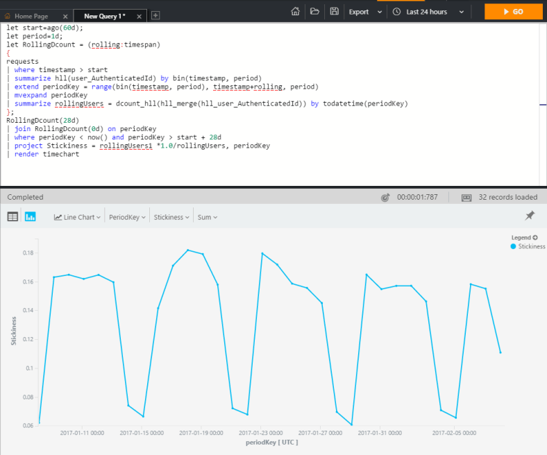
let start=ago(60d);
let period=1d;
let RollingDcount = (rolling:timespan)
{
requests
| where timestamp > start
| summarize hll(user_Id) by bin(timestamp, period)
| extend periodKey = range(bin(timestamp, period), timestamp+rolling, period)
| mvexpand periodKey
| summarize rollingUsers = dcount_hll(hll_merge(hll_user_Id)) by todatetime(periodKey)
};
RollingDcount(28d)
| join RollingDcount(0d) on periodKey
| where periodKey < now() and periodKey > start + 28d
| project Stickiness = rollingUsers1 *1.0/rollingUsers, periodKey
| render timechart

STICKINESS ON THE FLY!

stickiness

App Analytics: Using “Let”, and a really useful investigation query

So here’s just a small tidbit that can be useful.

First the “let” keyword – it basically allows you to bind a name to an expression or to a scalar. This of course is really useful if you plan to re-use the expression.

I’ll give an example that I use in real-life – a basic investigative query into failed requests. I’m joining exceptions and failed dependencies (similar to NRT proactive detection). I’m using the let keyword to easily modify the time range of my query.

Here it is, enjoy!


let investigationStartTime = datetime("2016-09-07");
let investigationEndTime = investigationStartTime + 1d;
requests
| where timestamp > investigationStartTime
| where timestamp < investigationEndTime
| where success == "False"
| join kind=leftouter(exceptions
   | where timestamp > investigationStartTime
   | where timestamp < investigationEndTime
   | project exception=type , operation_Id ) on operation_Id
| join kind=leftouter (dependencies
   | where timestamp > investigationStartTime
   | where timestamp < investigationEndTime
   | where success == "False"
   | project failed_dependency=name, operation_Id ) on operation_Id
| project timestamp, operation_Id , resultCode, exception, failed_dependency