There is a nifty little operator in Azure Log Analytics that has really simplified how I work with regular expressions – It’s called “parse” and I’ll explain it through a little example.
Let’s say you have a service that emits traces like:
traces
| where message contains "Error"
| project message
11:07 Error-failed to connect to DB(code: 100)
12:02 Error-failed to connect to DB(code: 100)
12:05 Error-query failed on syntax(code: 355)
12:06 Error-query failed on timeout(code: 567)
I’d like to count how many errors I have from each code, and then put the whole thing on a timechart that I can add to my dashboard, in order to monitor errors in my service.
Obviously I’d like to extract the error code from the trace, so I need a regular expression.
Well, if you’re anything like me the first thing you’ll do is start feverishly googling regular expressions to try to remember how the heck to do it… and then flailing for like an hour until getting it right.
Well, using parse, things are much much easier:
traces
| where message contains "Error"
| parse message with * "(code: " errorCode ")" *
| project errorCode
100
100
355
567
And from here summarizing is just a breeze:
traces
| where message contains "Error"
| parse message with * "(code: " errorCode ")" *
| summarize count() by errorCode, bin(timestamp, 1h)
| render areachart kind=stacked
It sounded a lot like a challenge to me, so I just couldn’t resist!!
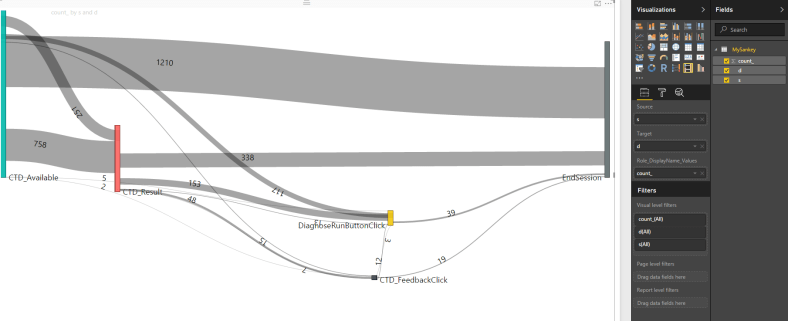
Sankey diagrams for those who don’t know are an amazing tool for describing user flows AND are the basis for one of the most famous data visualizations of all-time. But really, I had no idea how to create one. So, I googled Sankey + PowerBI and came across this fantastic Amir Netz video:
So all you need to create the diagram is a table with 3 columns:
Source
Destination
Count
And PowerBI takes care of the rest.
We already know you can take any App Insights Analytics query and “export” the data to PowerBI.
So the only problem now is how do I transform my AppInsights custom events table into a Sankey events table?
Let’s go to Analytics!
First it’s best to have an idea of what we’re trying to do. Decide on 5-10 events that make sense for a user session flow. In my case, I want to see the flow of users through a new feature called “CTD”. So the events I chose are:
CTD_Available (feature is available for use)
CTD_Result (user used the feature and got a result)
CTD_DrillIn (user chose to further drill-in the results)
CTD_Feedback (user chose to give feedback)
In every step, I’m interested in seeing how many users I’m “losing”, and what they’re doing next.
Ok, let’s get to work!
First query we’ll
Filter out only relevant events
Sort by timestamp asc (don’t forget that in this chart, order is important!)
Summarize by session_id using makelist, to put all events that happened in that session in an ordered list. If you’re unfamiliar with makelist, all it does is take all the values of the column, and stuffs them into a list. The resulting lists are the ordered events that users triggered in each session.
customEvents
| where timestamp > ago(7d)
| where name=="CTD_Available" or name=="CTD_Result" or
        name=="CTD_Drillin" or name== "CTD_Feedback"
| sort by timestamp asc
| summarize l=makelist(name) by session_Id
Next step I’ll do is add an “EndSession” event to each list, just to make sure my final diagram is symmetric. You might already have this event as part of your telemetry, I don’t. This is optional, and you can choose to remove this line.
To do this, I need to chop off the first item in the list and “zip” it (like a zipper) with the original list. In c# this is very easy – list.Zip(list.Skip(1))..
Amazingly, App Analytics has a zip command! Tragically, it doesn’t have a skip… :(. Which means we need to do some more ugly regex work in order to chop off the first element.
I wanna show two real-world examples (it really happened to me!) of extracting data from traces, and then using that data to get really great insights.
So a little context here – I have a service that reads and processes messages from an Azure Queue. This message processing can fail, causing the same message to be retried many times.
I We recently introduced a bug into the service (as usual.. ) which caused requests to fail on a null reference exception. I wanted to know exactly how many messages were affected by this bug, but it was kind of hard to tell because the retries cause a lot of my service metrics to be off.
Luckily I have a trace just as I am beginning to process a message that shows the message id :
Another nice feature of Kusto / Application Insights Analytics is full on support for regular expressions using the extract keyword.
A very useful application of this is all matter of manipulations you can do over the “url” field in requests. A common ask is understanding how much traffic is generated by any of your different hosts.
Since Analytics only carries the full url field, we need to parse out the host out using a regex. I took a really really simple regex in this case, but obviously it can be much more complex.
pageViews
| where timestamp > ago(1d)
| extend urlhost=extract('^(http://|https://)([^:\\/\\s]+)', 2, url)
| summarize count() by urlhost
| render piechart
Update:
There is now a simpler method to extract all url parts – parseurl.


