There’s a pretty nice operator in Kusto (or App Insights Analytics) called top-nested.
It basically allows you to do a hierarchical drill-down by dimensions. Sounds a bit much, but it’s much clearer when looking at an example!
So a simple use for it could be something like getting the top 5 result-codes, and then a drill down for each result code of top 3 request names for each RC.
requests
| where timestamp > ago(1h)
| top-nested 5 of resultCode by count(),
  top-nested 3 of name by count()
So I can easily see which operation names are generating the most 404’s for instance.
This is pretty cute, and can be handy for faceting.
But I actually find it more helpful in a couple of other scenarios.
First one is getting a chart of only the top N values. For instance, if I chart my app usage by country, I get a gazillion series of all different countries. How can I easily filter the chart to show just my top 10 countries? Well one way is to do the queries separately, and add a bunch of where filters to the chart…
But top nested can save me all that work:
let top_countries = view()
{
  customEvents
  | where timestamp > ago(3d)
  | top-nested 5 of client_CountryOrRegion by count()
};
top_countries
| join kind= inner
  (customEvents
    | where timestamp >= ago(3d)
   ) on client_CountryOrRegion
| summarize count() by bin(timestamp, 1h), client_CountryOrRegion
| render timechart

A beautiful view of just my top 5 countries…
I’ve actually used the same technique for a host of different dimensions (top countries, top pages, top errors etc.), and it can also be useful to filter OUT top values (such as top users skewing the numbers), by changing the join to anti-join.
The second neat scenario is calculating percentages of a whole. For instance – how do you calculate the percentage of traffic per RC daily?
Yeah, you can do this using a summarize and the (newly-added) areachart stacked100 chart kind:
requests
| where timestamp >= ago(3d)
| where isnotempty(resultCode)
| summarize count() by bin(timestamp, 1h), resultCode
| render areachart kind=stacked100

But this only partially solves my problem.
Because ideally, I don’t want to look at all these 200’s crowding my chart. I would like to look at only the 40X’s and 500’s, but still as a percentage of ALL my traffic.
I could do this by adding a bunch of countif(rc=403)/count(), countif(rc=404)/count()… ad nauseum, but this is tiresome + you don’t always know all possible values when creating a query.
Here’s where top-nested comes in. Because it shows the aggregated value for each level, creating the percentages becomes super-easy. The trick is simply doing the first top-nested by timestamp:
requests
| where timestamp > ago(14d)
| top-nested 14 of bin(timestamp, 1d) by count() ,
  top-nested 20 of resultCode by count()
| where resultCode !startswith("20")
| where resultCode !startswith("30")
| project pct=aggregated_resultCode * 1.0 / aggregated_timestamp,
          timestamp, resultCode
| render timechart
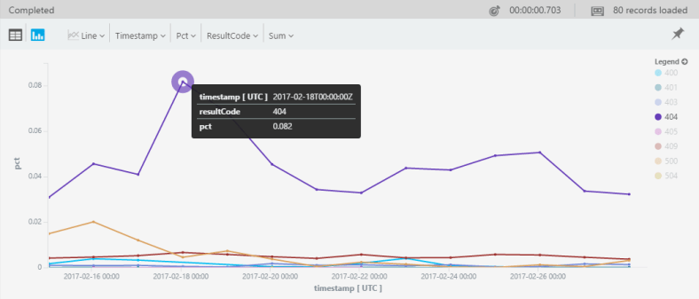
Pretty nice, no?


