App Insights Analytics just released Smart Diagnostics, and it is by far the best application of Machine Learning analytics in the service to date.
I’ve posted before about some ML features such as autocluster and smart alerting, but this one really takes the cake as the most powerful and useful yet:
- It’s super-duper easy to use! Despite the huge complexity of the Machine Learning algo behind the scenes.
- It’s fast!
- It can give you awesome answers that save you lots of investigation time and agony.
It works by analyzing spikes in charts, and giving you a pattern that explains the sudden change in the data.
So let’s give it a go!
Analyze spike in dependency duration
I run a service that has all kinds of remote dependencies – calls to Azure blobs, queues, http requests, etc.
In my devops hat, I run this simple query almost daily just to gauge the health of my service – a look at the 95th percentile for call duration by dependency type:
dependencies
| where timestamp > ago(1d)
| where operation_SyntheticSource == ""
| summarize percentile(duration, 95) by bin(timestamp,30m), type
| render timechart
The results look like this:
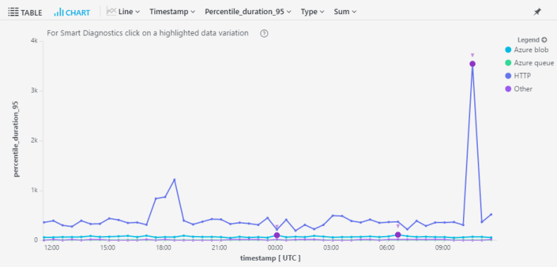
Right off the bat I can see something very funky going on in my http calls. I wanna know exactly what’s going on, but drilling in to the raw data can be a messy business.
If only there was a way to analyze that spike with just one click…. !!!
Fortunately, there’s a small purple dot on that spike. It signifies that this spike is available for analysis with Machine Learning (aka Smart Diagnostics).
Once I click on it, the magic happens.

Smart Diagnostics just told me that the cause for the spike in call duration was:
- name: https://../observation
- operation_Name: HealthyFlow
- resultCode: 409
- success: False
Whoa!
Furthermore, looking at the chart I see that calls without this pattern are totally flat in this time period.
This is definitive proof that the spike was caused by failed calls to this dependency. My work here is done in seconds.