How to Split your Data Into A Fixed Amount of Buckets

Okay, another question from Twitter (original content will have to wait till I get some more free time!)

Here’s the challenge:
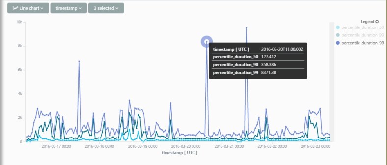
So what we need to do here is somehow infer the time-range of the query, and then create a fixed set of time bins according to that range.

I think the only way to that is by performing 2 queries – one to get the time range and convert it into a fixed interval, and a second query with the actual logic.

To convert the result of the first query into a ‘variable’ we can use in the second query, I’ll use the ‘toscalar‘ operation.

Here we go:

let numberOfBuckets = 24;
let interval = toscalar(requests
| summarize interval = (max(timestamp)-min(timestamp)) / numberOfBuckets
| project floor(interval, 1m));
requests
| summarize count() by bin(timestamp , interval)

I use ‘floor’ here just to round the interval and make the results a bit more readable.

Cool Azure Log Analytics: Joining requests and dependencies

Another cool thing you can do with App Insights Analytics is join different data types to get a good understanding of what’s happening in your app.

A great example are remote dependencies – this is an out-of-the-box feature in App Insights that logs all remote dependency calls such as SQL, Azure, http etc. If you’ve got that data flowing, you can get amazing insights with just a few small queries.

Here’s a small example – Lets’ try and find out which resources are real time-hogs in my service. The query I spun out is – per http request, get the average duration spent calling each dependency type.

requests
| where timestamp > ago(1d)
| project timestamp, operation_Id
| join (dependencies
        | where timestamp > ago(1d)
        | summarize sum(duration) by operation_Id, type 
        ) on operation_Id
| summarize avg_duration_by_type=avg(sum_duration) by type, bin(timestamp, 20m)
| render barchart

request_join_dependencies

Cool AppInsights Analytics: Charting common exceptions causing failed requests

Here’s a really simple but powerful query charting the most common exceptions causing requests to fail.

We do this by first getting all the failed requests, and joining them to exceptions according to operation_id.

Then we just chart it using a timechart.

requests
| where timestamp > ago(3d)
| where success == "False"
| project timestamp, duration, id, operation_Id
| join (exceptions
   | where timestamp > ago(3d)
   | project type, method, operation_Id) on operation_Id
| summarize count() by type, timestamp bin = time(1h)
| render timechart

request_join_exceptions

Cool AppInsights Analytics: Percentiles

Another awesome feature in App Analytics is the ability to calculate statistics on the fly on your data. One example of that is percentile stats.

Here is an easy and extremely useful example – analyzing the duration of server requests in your service.

requests 
| where timestamp > ago(7d)
| summarize percentiles(duration, 50, 90, 99) by bin(timestamp, 1h)
| render timechart

percentile

Cool AppInsights Analytics: Custom dimensions and measurements

In App Analytics you can slice and dice on your App Insights custom dimensions and measurements just as easily as any of the so-called “standard” properties.

The only thing that’s a little bit tricky is extracting them first.

It’s tricky because of 2 things:

  1. You have to explicitly set the type of the measurement/dimension after you extract it.
  2. Extracting properties that contain spaces and special characters is a little bit of a hassle.

Here is an example of me doing both:

customEvents 
| where timestamp > ago(3h)
| where name == "Query"
| extend query_time = todouble(customMeasurements.['Query Time'])
| extend query_name = tostring(customDimensions.['Query Name'])
| project query_time, query_name
| summarize avg(query_time) by query_name 
| render barchart

CustomDimensions

If you liked this, check out some other cool analytics queries: